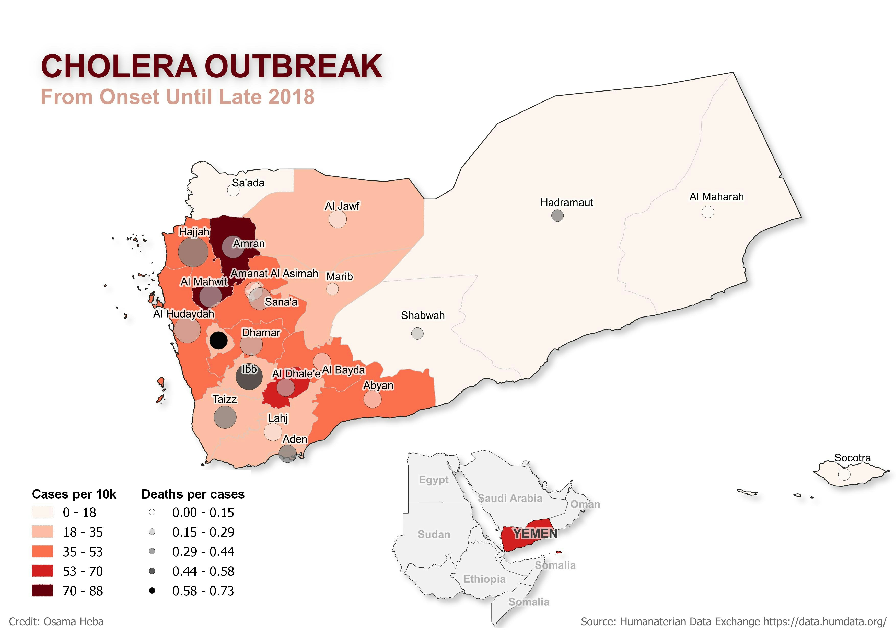
This project was focused on illustrating different indicators that shed light on the scale of the pandemic
- QGIS was the software used for this task
- Spatial and relational joins were the main tools in processing and merging the data
- Absolute values transformed to ratios and rates to make better sense
- data from https://www.naturalearthdata.com/ and https://data.humdata.org/ are the main source for the analysis
Possible ways for improvement:
- Considering colorblind-friendly gradient or patterned choropleth instead of the red gradient
- Including in the legends a descriptor for the change of the bubble sizes that are present in the map - they represent total deaths.

![Projeto - Análise Espacial [1/2]](/_next/image?url=https%3A%2F%2Fstorage.googleapis.com%2Fspatialnodefiles%2Fprojects%2F9c96159b-e45d-4811-b8b1-236f8d9c3a98layoutmapametro.png&w=3840&q=100)