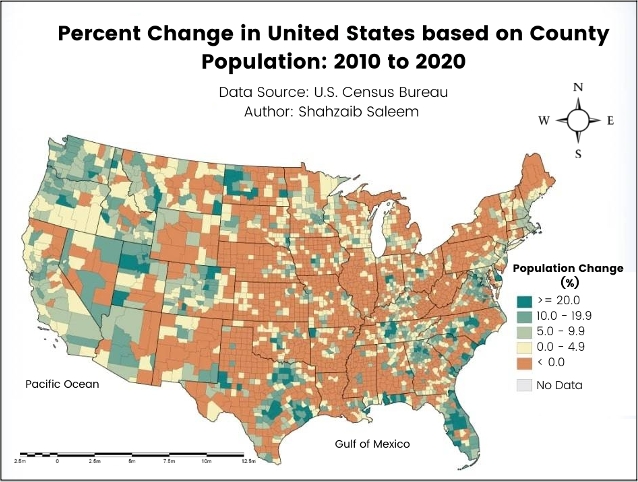
The map "Agreement rates on 'Childcare is difficult to find' compared to the state average" was created using QGIS, a free and open-source geographic information system (GIS) software. The goal was to provide a visual representation of how different regions within a state perceived the availability of childcare services compared to the overall state average.
The project began with data acquisition and cleaning of survey responses that asked households to rate their agreement with the statement "Childcare is difficult to find" on a 1 to 5 scale. Responses were aggregated to calculate the average agreement rate for each region.
To compare against the state average, a weighted mean was computed taking into account regional population sizes. This state average served as the baseline for comparison.
In QGIS, regional boundary data was loaded and joined with the corresponding agreement rates. A choropleth map was styled using a diverging color scale – dark blue representing regions with above-average agreement rates (indicating greater difficulty finding childcare), and dark orange representing below-average rates. The color scale gradually transitioned between these two hues based on how far each region's rate deviated from the state average.
A clear legend was added, allowing viewers to interpret the bivariate color scheme and the associated agreement rate ranges it represented. Hover tooltips displayed precise rates for enhanced interactivity.
The final map product highlighted areas struggling with childcare availability based on their relative standing compared to the state's overall perception average. It was exported for distribution.