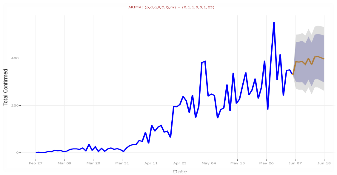
This exercise was part of the course Introduction to Big Data at Centre for Continuing Education and Professional Development (NTNU Videre) in 2021.
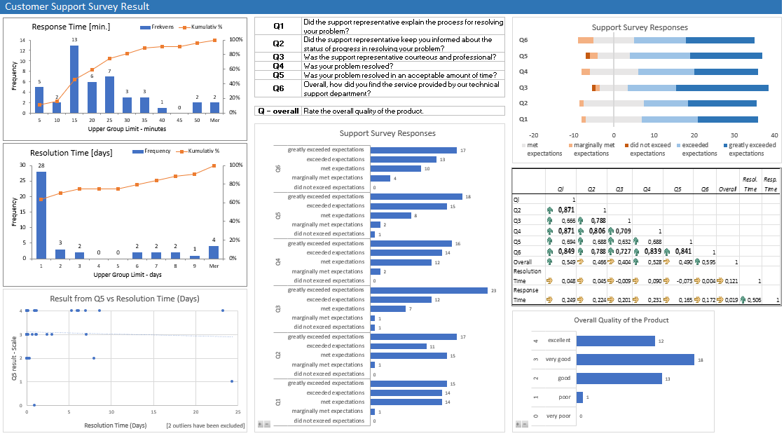
The case was the following: A producer of computer-aided design software for the aerospace industry receives numerous calls for technical support. Tracking software is used to monitor response and resolution times. In addition, the company surveys customers who request support using a scale from 0 to 4 where 4 is the most positive outcome. The task was to use whatever Excel charts and descriptive statistics that seem appropiate to convey the information in the sample data given for the task.
Report - findings and conclusion:
Overview - Response Time:
- Most calls in the data sample were responded to in the interval 11 - 15 minutes.
- 50% of the calls were responded to after approximately 17 - 18 minutes.
- 80% of the calls were responded to after approximately 30 min.
Overview - Resolution Time:
- Most cases in the data sample (64%) were solved within 1 day.
- Approximately 80% of the cases were solved within 6 days.
Result from Question 5 vs. Resolution Time:
One might assume that there would be a correlation between the resolution time and the result of Q5 (Was your problem resolved in an acceptable amount of time). But the data sample does not show any correlation here. "Acceptable amount of time" does not necessary mean "short amount of time". The customers seem to understand that some cases may take longer time to solve. (2 outliers have been removed from this chart.)
Support Survey Responses (2 charts):
The results of the support survey show in general that the technical support met the customers expectations.
The score for question 3 (Was the support representative courteous and professional?) was especially high.
The results are shown in two charts: one chart is more visual, to give a quick overview, and the other one is more descriptive with more text and numbers.
The visual chart shows clearly that the results are mainly on the positive side, that the expectations by the customers have been met by the support team (grey to blue color).
Correlation Table:
It seems that the support representatives did a good job in terms of explaining the process and keeping the customers informed about the status of progress in resolving the case. As question 6 stated (Overall, how did you find the service provided by our technical support dep.?) the customers seem to be reasonable satisfied with the support process and that seems to have a positive correlation to all the other questions.
Resolution time and response times for this data sample do not show any correlation to the questions.
Overall Quality of the Product:
The overall quality of the product is rated high. Most customer rated it very good (18) and almost equally many rated it excellent (12) and good (13) in this data sample.


 He")