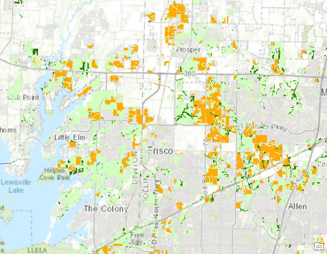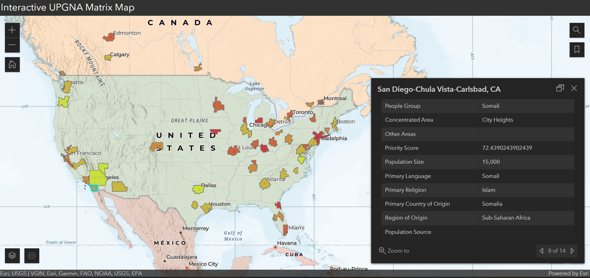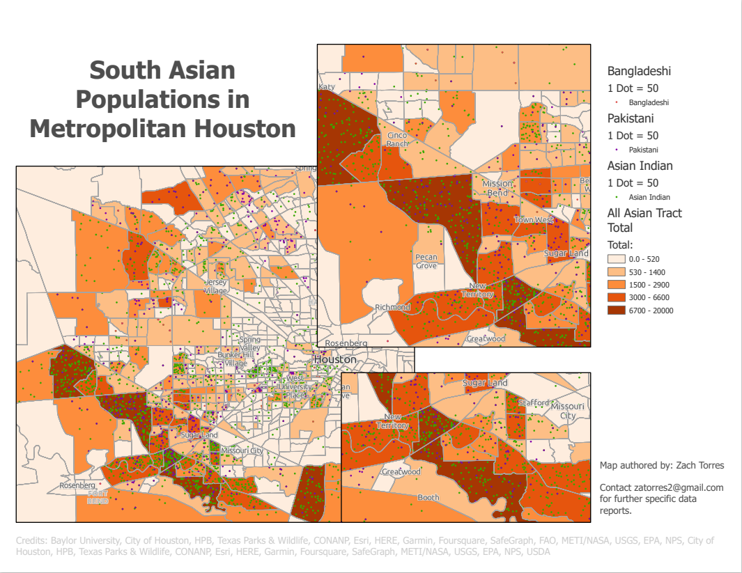
At the request of a team based Houston, I created this layout export visualizing three specific populations by census tract from Data Table B02015 with dot density symbolization.
My workflow is described below:
- Downloaded TIGER shapefile for census tract boundaries for the USA.
- Cleaned data in Excel from census API table downloads so that only countries of origin represented in the UPGNA Priority Matrix remain. Did not include any Margins of Error columns.
- Saved Excel sheets as .csv files
- Joined .csv files to shapefiles through Joins based on AFFGEOID.
- Exported data in new layer to feature class (this saved it to the project geodatabase rather than existing as a temporary file).
- Configured properties and symbolized layers appropriately using dot density as the primary symbology and consistent dot values.
- Exported project to layout with gridlines and fit window extents to areas of study. Configured labels, legend, and marginalia for visual balance.
Click on the demo link below to take a closer look!